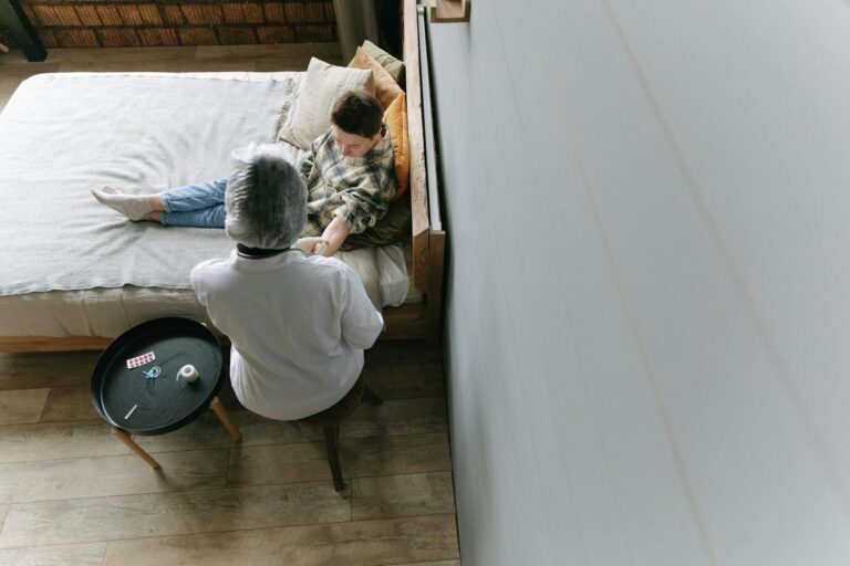
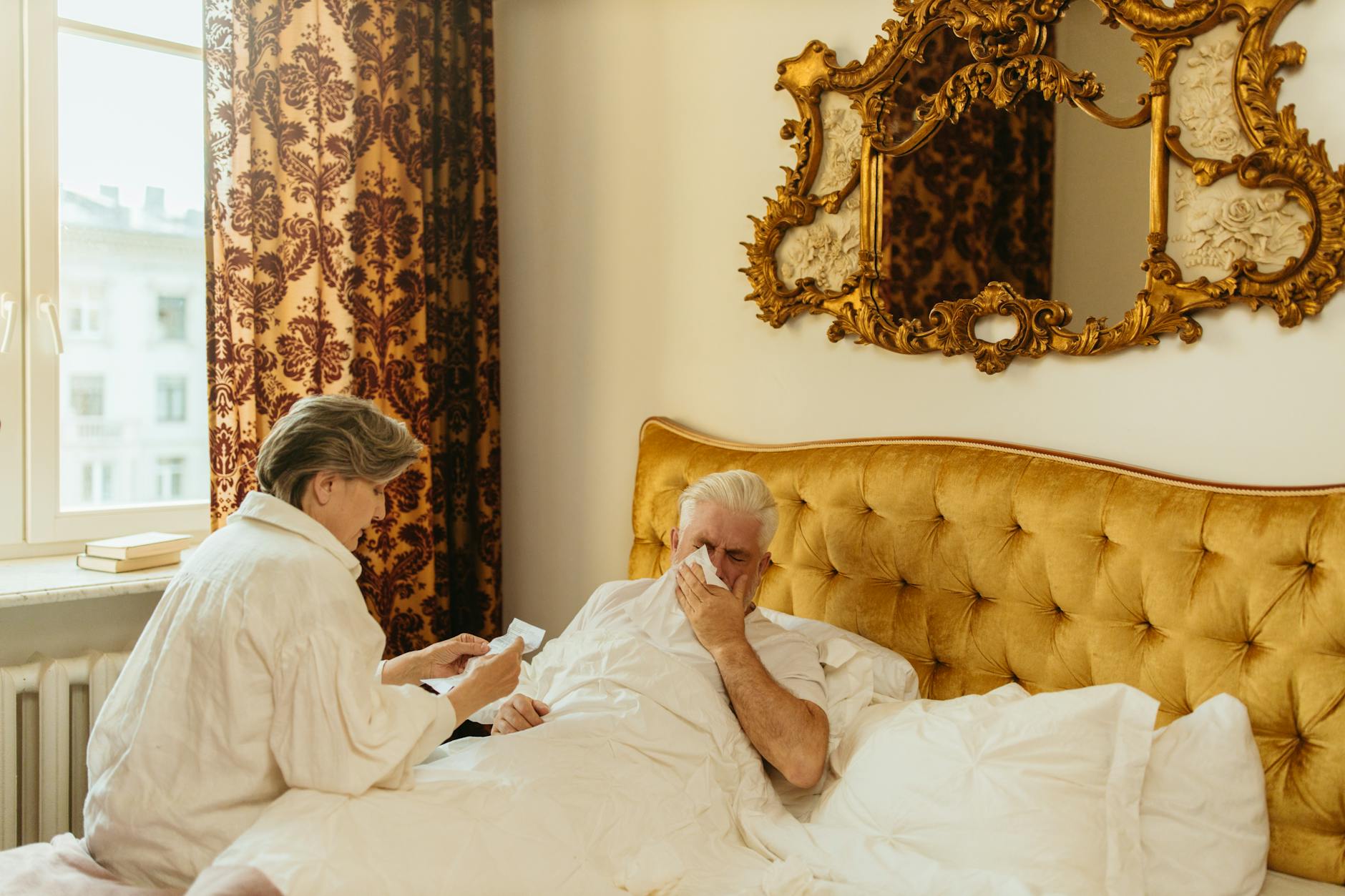
The best chair cushion color for someone living with Alzheimer’s disease is a solid red, warm orange, or lime green — placed against a contrasting chair frame and floor. This is not a matter of interior decorating preference. It is a clinical consideration rooted in how Alzheimer’s progressively damages color perception along the blue axis of vision, while largely sparing the ability to see warm, saturated hues. A red cushion on a tan or light wood chair, for instance, creates both the color visibility and the contrast needed for a person with mid-stage Alzheimer’s to locate and safely sit in that chair.
Get this wrong — say, a navy cushion on a dark gray frame — and you may be looking at increased confusion, hesitation, and fall risk. Up to 60 percent of people with dementia experience impaired vision, not because of eye disease but because the brain’s capacity to interpret visual information deteriorates alongside cognitive decline. That statistic alone should change how families and care facilities think about something as seemingly mundane as cushion color. This article covers why Alzheimer’s disease specifically attacks blue-spectrum perception, which colors remain visible the longest, the critical role of contrast measured in Light Reflectance Value, which colors and patterns to avoid entirely, and how 2025 design trends in senior living are finally catching up with the research.
Table of Contents
- Why Does Alzheimer’s Change How People See Chair Cushion Colors?
- Red, Orange, and Lime Green — What the Evidence Says About the Best Cushion Colors
- The 30-Point Contrast Rule That Most Families Overlook
- How to Choose Between Red, Orange, Lime Green, and Pink for a Specific Room
- Colors and Patterns That Create Confusion and Fall Risk
- What 2025 Design Trends Mean for Dementia-Friendly Seating
- Reassessing Cushion Color as the Disease Progresses
- Conclusion
Why Does Alzheimer’s Change How People See Chair Cushion Colors?
alzheimer‘s disease causes a selective deficit in tritan — or blue — color discrimination. Studies published in PLOS ONE and indexed in PubMed have found that people with Alzheimer’s make significantly more errors identifying blue tones on color vision tests, while their ability to distinguish reds and greens remains relatively intact. This blue-axis deficit appears early in the disease process and may be independent of overall disease severity, meaning it can show up before other symptoms become pronounced. The practical consequence is stark: a blue or blue-green cushion that looks perfectly visible to a caregiver may be nearly invisible or deeply confusing to the person with Alzheimer’s sitting in that chair. Beyond the tritan deficit, people with dementia experience a measurable reduction in perceived saturation. Reds begin to look like pinks. Vibrant colors appear washed out.
Contrast sensitivity drops. This is why a pastel lavender cushion that seems “calming” to a designer may register as a vague, indistinct blur to someone with moderate Alzheimer’s. The brain is no longer processing color with the same fidelity, and every step away from bold, saturated, warm tones makes the problem worse. The research here is substantial enough that color vision deficits are being explored as early biomarkers for Alzheimer’s. A novel screening test called the RGB-vision plate established a cut-off score of 25 with an area under the curve of 0.773 (p<0.001) for detecting Alzheimer's dementia. In another study, adding a color memory error score to diagnostic models improved classification accuracy from 77.9 percent to 84.4 percent for distinguishing normal cognition from mild cognitive impairment and early Alzheimer's. Color perception is not a peripheral symptom — it is tied directly to the neurodegenerative process.

Red, Orange, and Lime Green — What the Evidence Says About the Best Cushion Colors
Red is one of the last colors a person with dementia can recognize. This finding has led multiple dementia care organizations, including seating Matters and Anthem Memory Care, to recommend red for important functional objects — chairs, toilet seats, plates, cup handles — anything the person needs to locate and use. Because the tritan deficit selectively impairs the blue end of the spectrum while leaving red and green perception relatively intact, warm saturated tones are the logical choice. A solid red or warm orange cushion on a light-colored chair is about as visible as you can get. Lime green has also demonstrated effectiveness. Several assisted living facilities have adopted lime green as a visual cue — some have caregivers wear lime green shirts specifically to draw the attention of residents with dementia. The color works because it is a high-saturation, warm-leaning green that falls well outside the impaired blue axis.
For a cushion, lime green offers a strong alternative when red feels too institutional or when you need variety across multiple seating areas in a facility. Pink, too, has been characterized by Alzheimer’s research organizations as having an uplifting effect and decreasing aggressive tendencies, though it is worth noting that as saturation drops, pink can fade toward the washed-out zone that dementia patients already struggle with. A bold, saturated pink works. A barely-there blush does not. However, color alone does not solve the problem if the cushion blends into its surroundings. A red cushion on a dark cherry wood chair may offer excellent color recognition but poor contrast. This is where Light Reflectance Value enters the picture, and it is arguably as important as the color choice itself.
The 30-Point Contrast Rule That Most Families Overlook
The Dulux Trade and BRE Dementia-Friendly Colour Palette and Design Guide — which won an Exceptional Contribution to dementia care Award — recommends a minimum of 30 points of Light Reflectance Value difference between critical adjacent surfaces. LRV measures how much light a surface reflects on a scale of 0 (pure black) to 100 (pure white). For a chair cushion, this means you need at least 30 LRV points of difference between the cushion and the chair frame, and between the chair and the floor beneath it. Here is what this looks like in practice. A bright red cushion might have an LRV around 15 to 20. A light oak chair frame might sit around 55 to 60. That gives you a difference of 35 to 45 points — well above the threshold.
But place that same red cushion on a dark walnut frame with an LRV of 10, and suddenly you have only 5 to 10 points of difference. The person with Alzheimer’s cannot visually separate the cushion from the chair. The NHS specifically notes that chair upholstery and cushions must contrast with both the chair frame and the surrounding floor and wall colors. A brightly colored cushion on a neutral chair increases visibility and helps with spatial orientation. This principle extends beyond the chair itself. If the chair sits against a red accent wall, even a perfectly visible red cushion loses its effectiveness because the surrounding environment cancels out the contrast. The cushion needs to pop against everything around it — the frame, the floor, and the nearest wall or backdrop. Families often pick a good cushion color and then place the chair in a location that negates the benefit entirely.
How to Choose Between Red, Orange, Lime Green, and Pink for a Specific Room
The right cushion color depends partly on what is already in the room. A warm orange cushion works beautifully against a cool gray or beige chair and light flooring. Red works best against lighter neutrals — think tan, cream, or pale wood. Lime green is the strongest option when the room already has warm-toned walls or furniture, because it provides a different kind of contrast that warm reds might not achieve against warm surroundings. Pink, as noted, can reduce agitation and aggression, making it a thoughtful choice for rooms where behavioral symptoms are a concern — but only in a bold, saturated shade. The tradeoff between these colors is largely contextual.
Red carries the most research support as the single best-perceived color, but it can feel heavy or alarming in large doses, and in some cultural contexts it signals danger. Orange is nearly as visible but feels warmer and less intense. Lime green stands out against both warm and cool backdrops, making it the most versatile option for mixed environments, though some care teams find it aesthetically harder to integrate. Pink offers the behavioral calming benefit that the others do not, but it sacrifices some raw visibility compared to red. A practical approach for a facility with multiple seating areas: use red cushions in dining areas where locating a specific seat matters most, lime green in common rooms where general wayfinding is the priority, and pink in quieter spaces designed for relaxation. For a home setting, pick whichever of these colors offers the strongest contrast against your existing furniture and walls, then verify the LRV difference before committing.
Colors and Patterns That Create Confusion and Fall Risk
Black and very dark colors should be avoided on chair cushions for people with Alzheimer’s. Dark surfaces can be perceived as holes, voids, or shadows — a phenomenon that is especially dangerous for people with Lewy Body dementia who already experience visual hallucinations. A black cushion on a chair may cause someone to avoid sitting entirely, believing the seat is damaged or that there is a gap. Very dark navy and charcoal carry similar risks. Blue tones of any shade are a poor choice for functional objects. Given the documented tritan deficit in Alzheimer’s patients, blue simply does not register with the same reliability as warm colors. This applies to teal, aqua, periwinkle, and blue-gray — all of which fall within the impaired spectrum.
All-white environments pose the opposite problem: a stark white cushion on a white chair in a white room eliminates spatial cues entirely. Research has shown that all-white rooms can appear circular to someone with dementia, collapsing depth perception and making it impossible to distinguish one surface from another. Patterns present their own hazard. Solid colors are strongly preferred for dementia care environments. Busy or high-contrast patterns — stripes, florals, geometric prints, plaid — can be misinterpreted as movement, as uneven surfaces, or as hazards. A striped cushion might look like the seat is cracked or broken. A floral pattern might trigger attempts to pick up perceived objects. The Dementia Alliance International and Hekman Contract both emphasize that solid, saturated color in a single tone is the safest and most effective option for seating in dementia care.
What 2025 Design Trends Mean for Dementia-Friendly Seating
The senior living design world is finally aligning with the clinical evidence. A 2025 research article published in the MDPI journal Buildings emphasizes the intentional use of contrasting colors, textures, and lighting to demarcate functional areas in dementia-friendly buildings — moving beyond the old institutional approach of making everything beige. The trend in 2025 senior living favors saturated jewel tones — emerald, ruby red, deep saffron — balanced against lighter neutrals. A ruby-red chair cushion against soft beige walls and pale wood flooring is now considered both clinically appropriate and aesthetically desirable.
This is a meaningful shift. For years, dementia care environments defaulted to muted, “calming” palettes that inadvertently made navigation harder. The convergence of design trends and dementia research means families now have more commercially available options in the right color ranges. When shopping for a cushion, look for terms like “ruby,” “poppy red,” “tangerine,” or “chartreuse” — these tend to hit the saturated, warm-spectrum sweet spot that the research supports.
Reassessing Cushion Color as the Disease Progresses
One aspect that often gets overlooked is that visual perception continues to change as Alzheimer’s advances. A cushion color that works well in the early stages may need to be swapped for something bolder or higher-contrast as the disease progresses and saturation perception drops further.
Families should revisit the cushion-to-chair and chair-to-floor contrast every six to twelve months, or whenever they notice new signs of confusion around seating — hesitation before sitting, missed chairs, or attempts to sit on the chair arm instead of the seat. The forward-looking research into color vision as a diagnostic tool also suggests that as screening methods improve, care teams may eventually be able to tailor cushion and furniture color choices to the individual’s specific deficit profile rather than relying on population-level generalizations. For now, though, the population-level evidence is clear enough to act on: warm, saturated, solid-colored cushions with strong contrast against the chair and floor represent the best combination of visibility, safety, and comfort for the broadest range of Alzheimer’s patients.
Conclusion
The evidence points consistently in one direction. A solid-colored cushion in red, warm orange, or lime green — with at least 30 points of LRV contrast against the chair frame and surrounding surfaces — gives a person with Alzheimer’s the best chance of seeing, identifying, and safely using that seat. This is not about aesthetics. It is about working with the specific visual deficits that Alzheimer’s disease creates, particularly the well-documented tritan blue-axis impairment that leaves warm colors as the last reliable part of the spectrum. Avoid blue, black, white, and patterned fabrics.
Verify contrast not just between the cushion and the chair, but between the chair and the floor, and the chair and the nearest wall. Reassess as the disease progresses. And remember that something as simple as swapping a beige cushion for a red one can meaningfully reduce confusion, improve independence, and prevent falls. The research is there. The products are available. The barrier is usually just awareness.